Contrast: bold poster energy for documents that shout
Contrast is zero subtlety by design: black rules, uppercase headings, a slab of accent color. Below is a complete sample report rendered in it.
What does the Contrast theme look like?
This is a complete sample report rendered in Contrast: the exact output the editor downloads, embedded here unmodified.
What does every element look like in Contrast?
Every markdown building block, one at a time: the raw markdown on the left, that exact snippet rendered in Contrast on the right.
Headings
Markdown
# Quarterly report
## Revenue summary
### Regional breakdown
#### North America
Contrast
Quarterly report
Revenue summary
Regional breakdown
North America
Text
Markdown
The rollout finished on schedule, and adoption **exceeded projections** within the first week. Support tickets stayed *manageable* throughout, thanks to the `deploy.sh` script.
Contrast
The rollout finished on schedule, and adoption exceeded projections within the first week. Support tickets stayed manageable throughout, thanks to the deploy.sh script.
Links
Markdown
Read the [full changelog](https://example.com/changelog) or check the [migration guide](https://example.com/migrate) before upgrading.
Contrast
Read the full changelog or check the migration guide before upgrading.
Unordered list
Markdown
- Draft the proposal
- Circulate for feedback
- Ship the final version
Contrast
- Draft the proposal
- Circulate for feedback
- Ship the final version
Ordered list
Markdown
1. Clone the repository
2. Install dependencies
3. Run the test suite
Contrast
- Clone the repository
- Install dependencies
- Run the test suite
Nested list
Markdown
- Frontend
  - Component library
  - Routing
- Backend
  - Database schema
  - API endpoints
Contrast
- Frontend
- Component library
- Routing
- Backend
- Database schema
- API endpoints
Task list
Markdown
- [x] Write the proposal
- [x] Get sign-off from legal
- [ ] Schedule the launch
Contrast
Blockquote
Markdown
> Ship small, ship often, and let the data tell you when to stop.
Contrast
Ship small, ship often, and let the data tell you when to stop.
Code block
Markdown
```ts
export function total(items: number[]): number {
  return items.reduce((sum, n) => sum + n, 0)
}
```
Contrast
export function total(items: number[]): number {
  return items.reduce((sum, n) => sum + n, 0)
}
Table
Markdown
| Quarter | Revenue | Growth |
|---------|---------|--------|
| Q1      | $2.1M   | 12%    |
| Q2      | $2.6M   | 24%    |
Contrast
| Quarter | Revenue | Growth |
|---|---|---|
| Q1 | $2.1M | 12% |
| Q2 | $2.6M | 24% |
Footnote
Horizontal rule
Markdown
The first half closed strong.

---

The second half opened even stronger.
Contrast
The first half closed strong.
The second half opened even stronger.
Image
Markdown
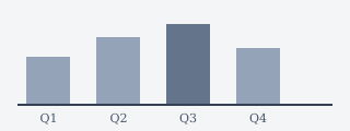
Contrast

Math
Markdown
The compound growth rate is $r = (V_f/V_i)^{1/n} - 1$.

Averaged across all quarters:

$$\bar{r} = \frac{1}{n}\sum_{i=1}^{n} r_i$$
Contrast
The compound growth rate is .
Averaged across all quarters:
Mermaid diagram
Markdown
```mermaid
graph TD
  A[Draft] --> B[Review]
  B --> C[Publish]
```
Contrast
Who is the Contrast theme for?
Pitches, one-pagers, launch briefs; short documents that need to be impossible to skim past. Less suited to 40-page reports.
Which themes pair well with it?
- Swiss: Strategy memos, design documents, and briefs for readers who notice typography. When in doubt between “more” and “less”, Swiss is the “less”.
- Pop: Team updates, internal newsletters, onboarding docs
Part of the Minimal & Clean collection: see the rest of the category.
100% in your browser · no upload · free · no sign-up